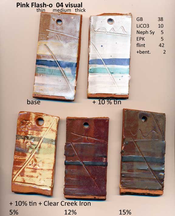
There’s a glaze that has been used by sculpture people for a fleshy surface. Lately Drew Avakian at UF has been looking into it for his constructed pottery. I like the waxy look, an tried it with iron. at 5% iron, it has dramatic thin-to-thick changes from rust to creamy, showing dark slip and breaking a bit on texture. Still testing the cordovan color to see if I can reproduce it on a piece. I think the tin could be lowered and still get results. Tin is expen$ive. Without the tin (and zirconium opacifier in its place), the color doesn’t quite look the same, I suspect. The waxy look and mottling is accentuated by the tin, and the iron color might be subtly different. But I don’t think it has to be 10%. I’m going to drop to 8%, and maybe later see if I can go to 5. The original glaze name is about using rutile to tint the glaze, and counts on there being some chrome impurities in the rutile to pink up the high-tin glaze. If doesn’t show on the test tiles, but on small pieces, thick glaze over the green copper + chrome slip does turn kind of mottled burgundy. It would take at least 5% tin if you care about chrome-tin pinking like that. I want the nice iron browns, waxy surface, and mottling/breaking.
